TILE SELECTION GUIDE
What do V shade variation ratings mean?
A V rating describes the expected visual difference between tiles from the same product. Every level creates a different visual character; a higher or lower rating does not mean better or worse quality.
Calm, balanced uniformity
Visual character: differences between tiles are barely noticeable. Color, veining and pattern remain closely matched, producing a uniform surface from both near and far.
Benefits and beauty: creates a clean, orderly look with excellent visual calm, enhances spaciousness and surface continuity, and allows furniture, lighting and decorative features to stand out without visual competition.
Best for: calm contemporary and understated interiors, bathrooms, kitchens, compact spaces, and projects that need a coordinated, uniform backdrop.
Design tip: choose grout close to the tile color for a seamless, quiet finish, or contrasting grout when you want the laying grid to become a feature.

Gentle tonal movement
Visual character: subtle, controlled shifts in tone or pattern appear from tile to tile while the installation remains cohesive when viewed as a whole.
Benefits and beauty: adds gentle depth and refined liveliness without sacrificing calm. The surface feels more natural and layered than a fully uniform finish while remaining easy to coordinate.
Best for: living areas, bathrooms, kitchens, and transitional interiors that balance clean design with a natural touch.
Design tip: mix tiles from several cartons during installation so the gentle tonal movement remains balanced rather than clustering in one area.

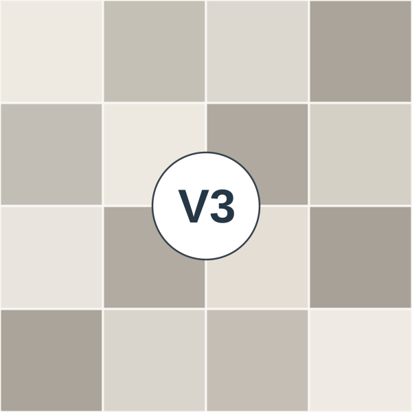
Distinct natural variation
Visual character: noticeable shifts in shade, veining or pattern occur between tiles, while every piece remains within the product’s intended color and design family.
Benefits and beauty: creates rich movement and convincing depth reminiscent of natural stone or marble, reduces visible repetition, and gives each space an individual character without becoming overly dramatic.
Best for: lounges, reception rooms, entrances, feature walls, commercial spaces, and projects seeking a striking yet balanced natural look.
Design tip: dry-lay a group of tiles before fixing, then adjust their positions so tones and veins flow naturally across the entire area.
Bold, one-of-a-kind composition
Visual character: tiles may vary strongly in tone, veining and pattern intensity, with lighter, darker and contrasting pieces intentionally included in the product design.
Benefits and beauty: transforms the surface into an artistic feature rich in detail and contrast, giving the project a strong identity that is difficult to repeat—much like genuine natural materials.
Best for: statement walls, grand entrances, reception rooms, generous spaces, retail and hospitality projects that call for strong visual impact.
Design tip: approve a layout before installation and open several cartons together to balance light and dark pieces and direct the veining intentionally.

How to choose
For a quiet, consistent surface, compare V1 and V2. For more movement and a natural look, view several V3 or V4 pieces before choosing.
Before installation
- Open several cartons and inspect pieces under the room lighting.
- Plan the distribution of different shades before fixing V3 or V4 tiles.
- Check the actual batch and shade information on product cartons.
These original illustrations explain variation; they do not represent a product for sale. A product's actual V rating is shown only when specified by its manufacturer.
Tile guide ←